eCommerce Search has evolved to be one of the most important features in any eCommerce website. The reason is because it helps the visitors to find quickly and easy the product they want. On top of that, it can be used to engage with the them and it also provides insightful data to the business to understand the behavior and the needs of its customers.
As mentioned on a previous blog, on an eCommerce website up to 30% of the visitors will eventually use the search bar. Just by this statistic you can understand the importance of having a good eCommerce search and the value it can add to your e-shop.
But how can you create an eCommerce search that will attract your customers and make them engage with your e-shop? What are the characteristics of an effective search that will distinguish you from the competition?
Let’s start with the basics…
Location of the search bar
Every e-shop should have the search bar in an obvious place in their site. You should position your bar in a strategic way so that it will be easy for your visitors to locate. If your users cannot find the search bar, you may be losing extra potential sales.
Most of the e-shops put their search bar on the top-middle or top-right of the page so that it will be directly visible to their customers and that is the best practice. However, you should make sure it is not too close to other boxes, like newsletter, because you need their full attention on the search bar, and you should not confuse them.
Take a look at bol.com ’s search bar for example, obvious from the first look at the website:

Size and Color
The size of the search bar is mostly based on your visitors’ behavior. Do they normally search for a product using a description? In that case, you would need to make the bar a bit longer so that it will be convenient for them to write inside it, and they will not be discouraged.
In case your users normally just search by one or two words then you can keep it smaller; no reason to take up space from the page.
Short or long, one thing is certain; it needs to draw the attention of your users. For this reason, you need to make sure you use the correct color for your search bar. That means, the color of the bar should be in contrast with the rest of the website, especially the header. For example:

Texts in the search bar
Even though most of the users are used to the search bar, there are many that are still “newbies” in online shopping. The purpose of your search bar should be clear.
You can add some text inside the search bar to tell your customers what they should do, like “I am searching for…”. Next to the search bar you can also add a CTA like go or search with a nice icon, like a magnifying glass. There are many websites that do it the right way, like the one below:

Load Times
When running an ecommerce website, you need to make sure that everything works perfectly and is fast. If not, then why would the users come to you in the first place? People buying online do not have time to wait for your website to load; not to mention your search bar. Your load times are important, as a small delay can end up in loss of revenue.
You can run tests to check your load times and bring them to an acceptable level. And do not forget to check them also on mobile devices.
Breadcrumbs
Using the right breadcrumbs on your search results can be the key to engage with your customers. Generic ones like “Homepage Your Search Results” can actually irritate your users that do not know where to look for the correct product.
By providing the correct breadcrumbs you make sure your users will find what they are looking for. For example, a user is looking for eye shadow but do not know where to look for. With a detailed breadcrumb you can help them go back to the category they like and look for the product they need. An easy shopping experience will most likely end up in a sale.
You can see the difference in the breadcrumbs below:
![]()
![]()
With the second one, the user can see the categories before the product result and decide how many steps back they can go to look for the correct product.
Now that you know all the basics about a search should look like and work, let’s move on to the advanced practices.
Autocomplete
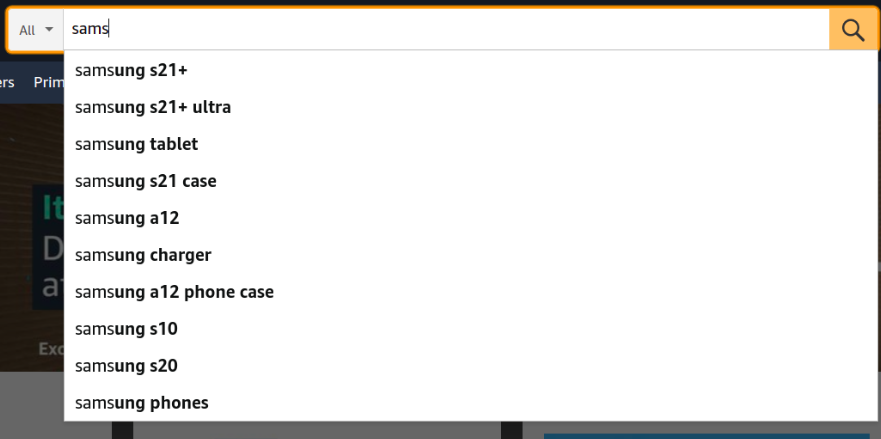
Providing product suggestions as the user types helps to speed up the search process. Users will just type-in the beginning of the word, see the suggested results that appear and decide if they will click on one of them. This allows them also to see the other suggested products in case they are interested.
Most importantly, it makes their experience better and faster, as they do not put the effort on writing a full search query. You can see below how Amazon uses the autocomplete feature:

Language
Your search bar should understand what your users are typing. You need to make sure that misspellings, synonyms and plurals are “ignored” in order to give to the user the right results.
This means that if someone types “mibile” they clearly mean “mobile”, but they just misspelled it. They expect you, however, to show the correct results without writing it again.
Mobile friendliness
Mobile users normally just browse on your website and they can view 1 or maximum 2 products per screen. For them it is much easier if your search is top-notch so that they will not lose time scrolling through all your products on mobile.
Make sure your search bar is visible by default on the top of the page at any time on the mobile devices to avoid users losing interest.
No results page
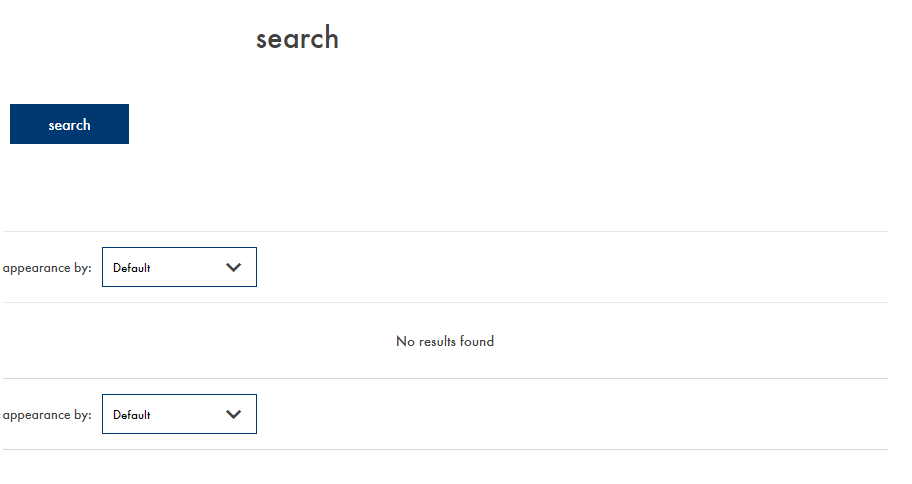
There will be times that a user will search for something that it not included in your product portfolio. Many e-shops just return a page like the one below:

The user is then discouraged to shop from this website and most of the times just leaves. However, there is a way to engage with your potential customers even if the product does not exist in your website.
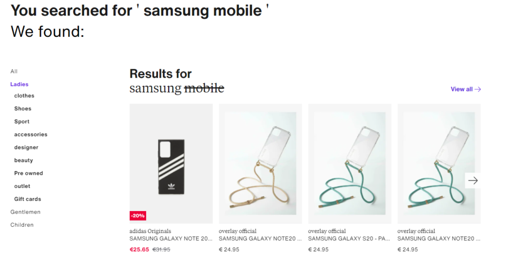
You can return some relevant results based on the user history or just some popular products so that you keep the user in your e-shop. Wouldn’t it be better if you show a page like the one below?

Be relevant
Showing the correct search results on your search bar is a must. However, showing the correct results while also being relevant to the user needs is perfection. You can use the user history to show them results that will interest them and not just the most popular ones matching to their query.
This way, you can engage with your customers in a higher level and increase the conversion rate already from the search bar!
Track the search terms
There are many tools that you can use for this, but if you are using an eCommerce search tool, it is for sure included in the services provided. Your users will look for any term on your website. Make sure you track all the terms to be able to understand what the popular items are or what you may be missing from your e-shop.
This way you can show the most popular products with priority or include new products in your portfolio and increase your sales.
Wrapping Up
Having a well-functioning search bar on your website is a definitely a must. However, implementing an intelligent eCommerce search can offer many advantages, like increased conversions and sales.
Usually, the users already have an idea of what they want when they visit your website. You just need to make sure you encourage them to use your eCommerce Search and provide them with a great user experience. Engaging with your customers can be the key to differentiate from your competitors.
Georgia Papaioannou
Business Development Manager at Reccodo
References
https://www.spacebetween.co.uk/blog/the-importance-of-a-good-ecommerce-search-bar
https://www.b3net.com/onsite-search-bar-important-part-website/
https://www.klood.com/blog/search-bar-on-ecommerce-site
https://econsultancy.com/four-reasons-why-site-search-is-vital-for-online-retailers/
https://www.webalive.com.au/effective-search-box/
https://www.bigcommerce.com/articles/ecommerce/site-search/#8-ecommerce-site-search-best-practices-
https://www.klaviyo.com/blog/ecommerce-search-for-your-website

